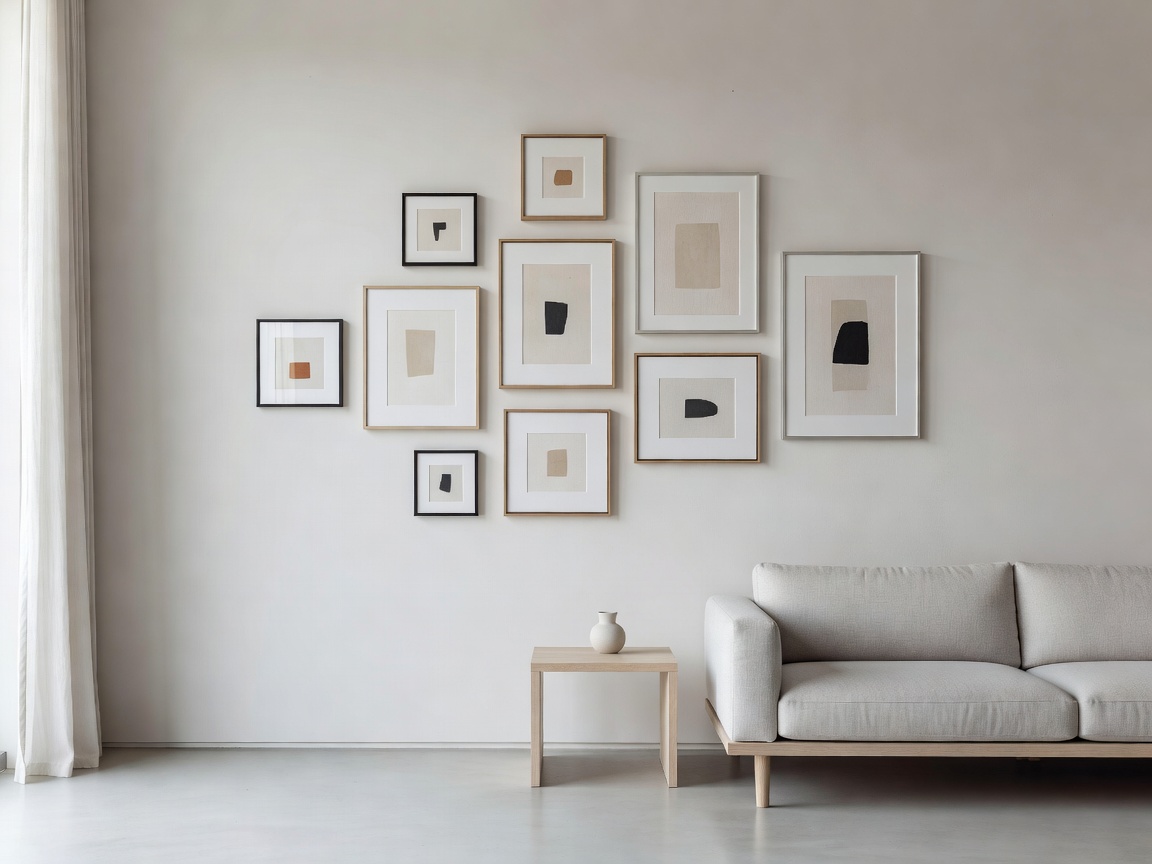
A gallery wall is not a random assortment of imagery; it is a calculated architectural grid. Executed correctly, it transforms disparate pieces of art into a singular, cohesive structural element. Executed poorly, it introduces visual chaos and spatial imbalance.
The Anchor Principle
Every successful gallery wall relies on an anchor. This is typically the largest or visually heaviest piece in the collection. Structurally, the anchor dictates the geometry of the surrounding pieces.
The anchor does not need to be positioned dead center. In asymmetrical grids, offsetting the anchor to the lower left or upper right establishes a dynamic tension that the smaller surrounding frames must balance. The rule of thumb is to place the anchor first, ensuring its center sits approximately 57 inches from the floor—the standard human eye level—and build outward from its borders.
Calculating Negative Space
The space between the frames is as critical as the frames themselves. Consistency in negative space is the invisible scaffolding that holds a gallery wall together.
- Tight Grids: For strict, geometric alignments of identical frames, a gap of 1.5 to 2 inches creates a dense, singular unit.
- Organic Grids: For mixed frames and varying sizes, expand the gap to 2.5 to 3.5 inches to allow each piece breathing room.
- Consistency: The cardinal rule is uniformity. If you select a 2-inch gap, that measurement must be maintained on all parallel and perpendicular axes between adjacent frames.
Balancing Visual Weight
Visual weight is dictated by frame thickness, mat size, color intensity, and subject matter density. A small frame with a thick black molding and a dark photograph carries more visual weight than a large frame with thin metal molding, an oversized white mat, and a pale sketch.
Distribute heavy elements diagonally across the grid. If a heavy, dark piece is anchored in the bottom left, a correspondingly heavy piece—or a cluster of smaller dark frames—should be positioned toward the top right to prevent the installation from appearing to "lean" or sag on the wall.
| Layout Topology | Characteristics | Ideal Environment |
|---|---|---|
| Grid Layout | Identical frames, perfectly aligned axes. | Formal spaces, long hallways, rigid architecture. |
| Column Layout | Aligned vertical outer edges, varied centers. | Narrow wall segments, between windows. |
| Organic / Cloud | Asymmetrical, radiating from an anchor. | Living rooms, eclectic spaces, stairwells. |
Prototyping the Layout
Never commit to wall anchors without prototyping the grid. The structural phase requires translating the art dimensions onto craft paper. Cut templates for every frame, mark the exact position of the hanging hardware on the paper, and tape the templates to the wall using low-tack painter's tape.
This allows you to step back, evaluate the visual weight, check the negative space measurements with a level, and make adjustments without compromising the drywall.
Conclusion
Curating a gallery wall is a drafting exercise. It demands adherence to spacing rules, an understanding of visual gravity, and rigorous planning. By treating the arrangement as a singular architectural installation, you elevate the individual pieces into a structural focal point.